Today’s market is highly competitive. Regardless of the niche your business is in, chances are there are tens of other businesses in the area offering the same products or services.
This begs the question, how can a business stand out in a highly competitive and saturated market? The answer to this tricky question lies in creating a consistent brand identity. This primarily involves developing a distinctive brand that depicts how you want your business to be perceived.
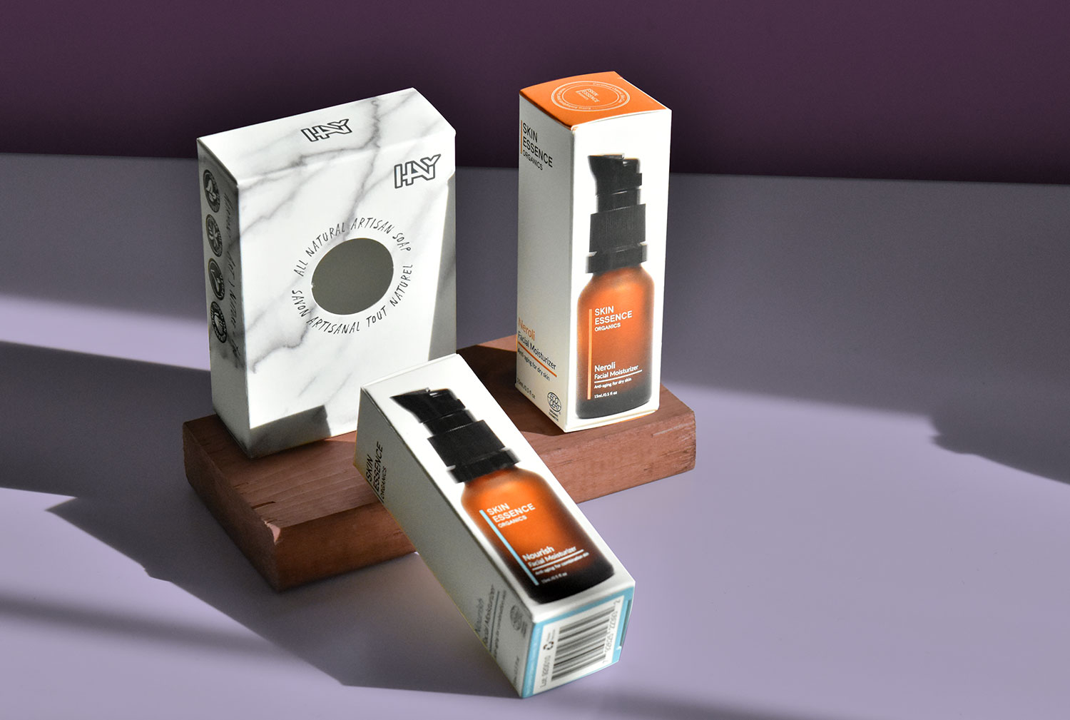
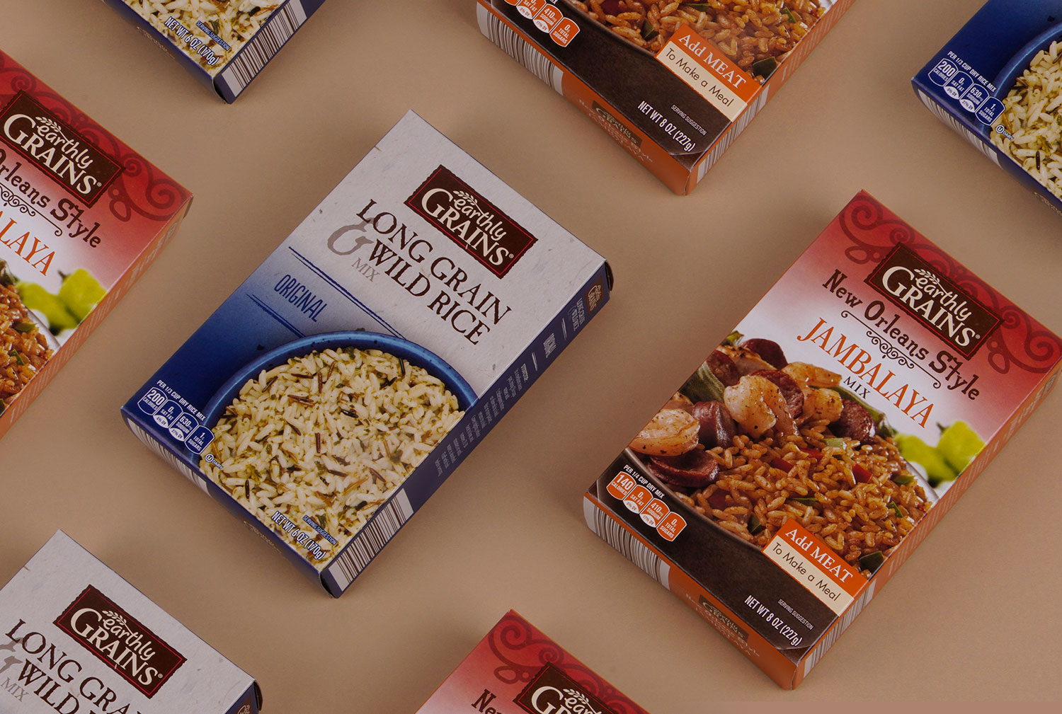
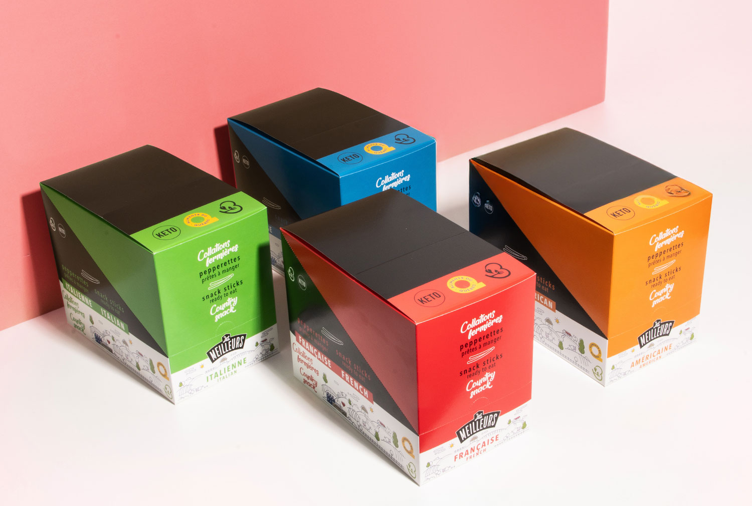
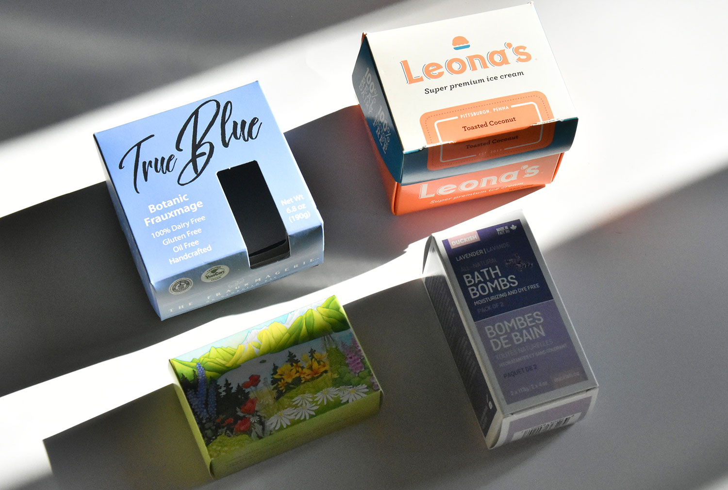
However, that’s just the start of it – you also need to ensure that you create a lasting impression on your customers every time they interact with your products. The best way to do that is through packaging.
Read on as we evaluate some essential elements of a good brand package design and what to avoid when creating one.
Brand Package Design Essentials
72% of US consumers say their purchase decisions are influenced by a product’s packaging design. They also take only 7 seconds to establish an impression of your brand but need to see it 5 to 7 times before they can recognize your logo.
Considering these facts, it’s vital to create an appealing branding package that communicates your brand identity and is visually appealing to your customers.
In that regard, here are a few branding package essentials every business should focus on.
Logo Design
Customers form emotional connections to their favorite brands through logos. Depending on your business packaging needs, you can have several logo variations to match specific products and packaging.
That said, the variations should not deviate too much from the primary brand look. They should also maintain a consistent color scheme and font to make them easily recognizable.
Brand Typography
How does your brand name appear to customers? Everything from font size, font type, and even character spacing can significantly impact how people perceive your brand. For instance, fonts like Proxima and Nova portray a playful tone, while fonts like Times New Roman look more professional.
Color Palette
A color palette maintains a consistent visual identity for your brand. The colors you choose should represent your brand’s identity and personality and elicit an emotional response from your customers.
That said, some colors work better than others.
What Colors to Avoid With Your Package
People take about 90 seconds to make up their minds after their initial interaction with a product. About 62% to 90% of this assessment is based on color alone, making it the most crucial factor to consider when designing a package.
Some colors can evoke the right emotions in your customers, leading to good results. However, the following color combinations might just do the opposite.
- Red and green
- Green and purple
- Red and blue
- Green and yellow
- Yellow and brown
- Orange and green
- Green and purple
Consult a Professional for a Good Brand Package Design
Building a successful brand isn’t just about offering the best products and providing personalized experiences for your customers. It’s also about choosing the right brand package designs that capture your customers’ attention and elicit positive emotional experiences.
For the best results, you should consult an experienced design partner to help capture your brand’s personality and incorporate it into your package design.


